The Leukaemia Foundation has a flexible brand system that’s efficient to use and allows us to deliver a consistent experience for our stakeholders.
These guidelines cover eight system elements: story, voice, logo, colours, typography, photos, videos and graphics and illustrations.
When you’re using any of our trademarks, logos, designs and/or other brand features, you acknowledge your acceptance of the terms in these brand guidelines.
The Communications and Marketing Services team at the Leukaemia Foundation is accountable for this brand system. Everyone utilising it, including our people and stakeholders, is responsible for complying with the guidelines.
Content or communications that features any part of the Leukaemia Foundation’s brand system (excluding existing templates and corporate stationary) must be approved by our Communications and Marketing Services team.
Communications including, but not limited to, new websites, proposals, email templates, newsletters, social media content, booklets, brochures and other promotional materials, photographs and videos will need to be approved if they use any part of this brand system. Please email [email protected] for usage approval.
We can’t wait to see you bring our brand to life!

The way a brand speaks to someone – through (both) written and visual language is important for connection and consistency.
Across the board, we are aiming to strike a balance of approachable and authoritative.
We have developed the ‘tone zone’ above, to help teams determine the tone of voice for a their communications. For more information on tone of voice, how it works, and links to individual team tone zones, head here (staff login required).
This language style guide is for people who create content on behalf of the Leukaemia Foundation, for external audiences. It’s a handy reference for key points of style and Australian English usage as followed by the Leukaemia Foundation. It also clarifies misunderstandings about spelling, grammar, punctuation and definitions.
Our master brand mark is the main visual identifier for the Leukaemia Foundation. Its appearance on promotional communication implies endorsement by the Leukaemia Foundation.
These guidelines ensure our mark is always used in a consistent and accessible way. We’re proud our mark scores AAA using Web Content Accessibility Guidelines (WCAG), if it’s used properly.
We have four variations of our master brand mark. You need permission from the Brand and Marketing Department to use this mark. Please request via [email protected]. Here are three guiding principles:
We also have logo lockups for our brilliant community supporters and partners to use. You don’t need to permission to use these; learn about them on the tab below. Find them here.
Make sure the first thing you do is email [email protected]. The Brand and Content Manager will get back to you within two working days.
If we think using the logo is the right fit for your project, we will send you the files you need, record the use in our register.
Please make sure you make a new request every time you use the logo so we can keep our records up to date.
![]()
![]()
![]()
![]()
Below are some examples of our Stack and Landscape community logo lockups. You can download the file(s) you need here (employee access only).
To help meet demand, there are a variety of different versions and file types to choose from. Follow the advice of your designer when it comes to file types. But if you’re unsure which to use, we advise the following:


Our logo is clear, well balanced and confident, traits that closely align with our values and brand personality. It has been constructed to allow for excellent legibility at most sizes on any application. Dynamic space has been installed between the L and the F, which can be utilised during our design processes, including motion graphics.

Clearspace around the logo is, at a minimum, equal to the height of the L in our logo.
![]()
Clear space exceptions
To make sure it gets the recognition it deserves our logo can only be shown in Primary Blue (on lighter backgrounds) or Reverse Light (darker backgrounds).
![]()
![]()
If you’re printing in grayscale, our logo is also available in black. We try to avoid using a black logo.
When placed on our primary colour palette, our logo should always be Primary, unless it’s placed on Dark, when it should be Reverse.
Our logo is designed to scale to smaller sizes on screen and print. Here are the minimum and recommended sizes for digital and print.
*Please note that the images below are not to scale
Digital Applications

Print Applications
Our logo can never be printed smaller than 20mm wide (constrained proportions)
Here are the recommended sizings for common page layouts.

The logo placement depends on the type of communication and use.
![]() General communication that includes text, the logo should be aligned bottom right.
General communication that includes text, the logo should be aligned bottom right.
![]() Digital communications, including websites, as well as functional applications, the logo should be top aligned.
Digital communications, including websites, as well as functional applications, the logo should be top aligned.
![]() Tall and narrow signage allows us to rotate our logo onto a vertical plane.
Tall and narrow signage allows us to rotate our logo onto a vertical plane.
When our logo is used with others all clear space rules must be followed. The separating line should be the height of our logo.
![]()
We always try to be inclusive and accessible and, because of our long name and limited space, our social icons feature a submark featuring only the L and the F from our logo.
Social app icons are individually designed based on platform specifications.

Don’t type out Leukaemia Foundation in other fonts or weights
Don’t type out Leukaemia Foundation in other fonts or weights
Don’t stretch or manipulate our logo in any way
Do not set our logo in a colour that isn’t Blue or Light.
Don’t pair our logo with symbols or marks that may be confused as logos
The logo is only to be used over images where there are no other options available and where the image has a clear, uncluttered space available to ensure it can be seen clearly.
Use the primary logo over lighter images.
Use the reverse logo over darker images.
Do not use the logo over busy images.
Our colours take advantage of our existing strong association with blue. They reflect our values and passion for life in a modern and caring way.
Our colours help us to add vibrancy and energy to our communications.
Make sure to use our colours in the way we’ve outlined below.
When we’re in control of the print process we use CMYK codes.
We aim to use our colours at 100% opacity where possible. Tints and gradients can be used for backgrounds.

Dark
Hex: #000d35
RGB: 0, 13, 53
CMYK: 98, 90, 45, 61

Blue
Hex: #001489
RGB: 0, 20, 137
CMYK: 100, 96, 13, 10

Sky
Hex: #adc9ff
RGB: 173, 201, 255
CMYK: 29, 15, 0, 0

White smoke
Hex: #f5f5f5
RGB: 245, 245, 245
CMYK: 3, 2, 2, 0

Care
Hex: #12d1c2
RGB: 18, 209, 194
CMYK: 66, 0, 34, 0

Bold
Hex: #b094ff
RGB: 176, 148, 255
CMYK: 37, 42, 0, 0
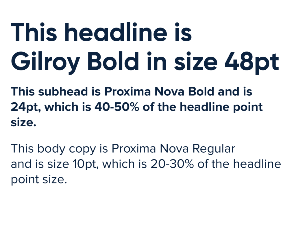
Our typography is easy to use by us and easy to read by our stakeholders.
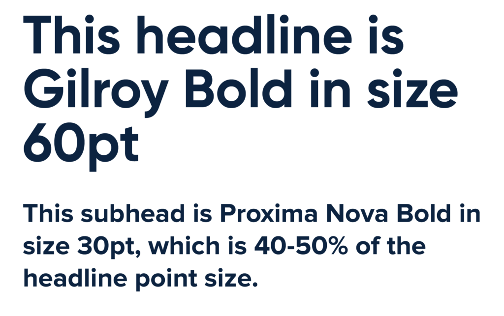
Gilroy Bold and Proxima Nova typefaces are both key elements of our brand system.
We use Arial typefaces internally.
These are the only fonts we use within the Gilroy and Proxima Nova families:
Gilroy Bold

Proxima Nova Regular

Proxima Nova Bold

Proxima Nova Light

Proxima Nova Condensed Regular

It’s important to use the following combinations and hierarchy to maintain consistency and clarity.
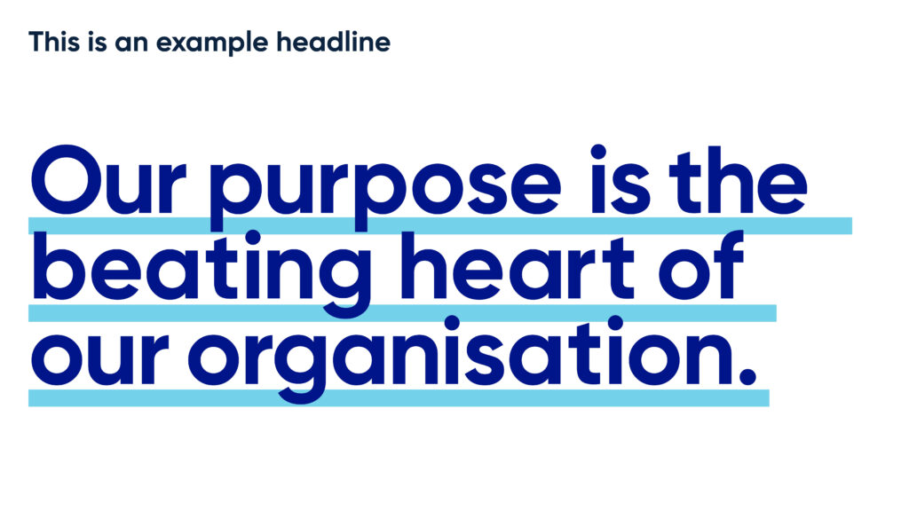
Where possible, we want to prioritise using big, bold impactful headlines.
Where there are subheads, these must be 40-50% of the headline point size.
Where there is also body copy, this must be 20-30% of the headline point size.
If there is no headline or subhead, body copy must be no smaller than 11pt (online and offline).
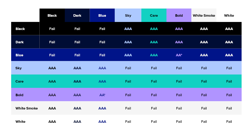
We always aim for the highest accessibility score possible when using text on on our primary colours, based on WCAG 2.0 Guidelines. We apply these digital guidelines for our work offline, too, so we look more consistent:
AAA = best and first choice
AA = great
AA Large = ok but only for text over 18pt
Fail = don’t ever use this combination
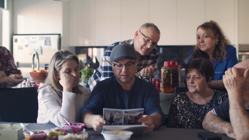
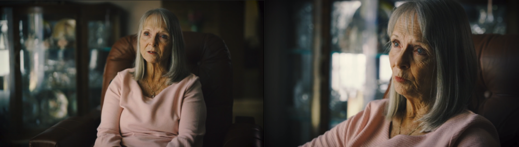
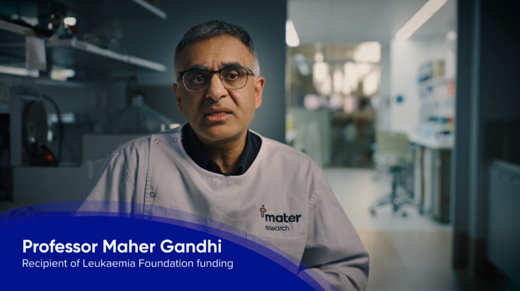
Photography is a crucial part of the Leukaemia Foundation brand. It is used to help tell stories as well as convey the brand’s tone of voice.
Our clean and natural style of photography brings the reader into the story by using raw and unfiltered subjects in natural environments.
We have photography available for Leukaemia Foundation staff to use in our resource library here (staff login required). Contact the Brand and Creative Team via [email protected] if you would like share any of our photography with third parties.
Images of blood cancer under a microscope are available for your use here (staff login required).


When people are the main subject of a photo, make sure they’re helping tell the story.
The composition of the image is at the discretion of the photographer and depends on the final output, audience and message.
It is important to ensure images appear to have natural light and colour.


Sometimes images will be supplied by a third party, resulting in photography that doesn’t adhere to the proposed guidelines.
When this is the case, use basic colour correction and retouching to get the image looking as natural and clean as you can, correcting any images that are too warm, cool, light, dark etc.
If the image contains any old Leukaemia Foundation branding, make sure to update it to the new branding through retouching.
Please use your best judgement and skill to ensure the images are represented as accurately as possible.
Don’t correct user generated content (UGC) because we want that to stay as authentic as possible to the original content creator.


Ensure that the footage appears clean and natural. When applying colour grading or enhancements, aim to faithfully represent the subject’s actual appearance.
To create a heartfelt look, a slight warming of the footage is acceptable but avoid cooling effects. Remember to maintain natural colours and avoid oversaturating them. Keep the contrast level natural as well.
Position the subject in the left or right-hand third of the frame when conducting interviews. It’s also recommended to have a second camera capturing a close-up of the subject for added visual impact.
Lower thirds
When introducing individuals in your video, use the cell-in-motion graphic device (staff login required for file) for the lower third. Position it at the bottom left or right of the screen, as shown in the example below:
The person’s name should be displayed in Gilroy Bold, while their title should be in Proxima Nova Regular.
Ensure that the name and title are placed above any subtitles appearing in the video.
End screen
To conclude a video, please use the Leukaemia Foundation standard end frame (staff login required for file) in the correct aspect ratio.
All videos produced for the Leukaemia Foundation should be recorded at a minimum resolution of 1080p. Avoid using footage below 1080p unless it is archival material.
Selecting the appropriate aspect ratio is crucial for an immersive viewing experience. The ratio should be determined by the primary distribution channel.
– YouTube/on screen: Use a 16:9 ratio (1920px x 1080px)
– Instagram/Facebook stories: Use a 9:16 ratio (1080px x 1920px)
– Instagram Feed: Use a 1:1 ratio (1080px x 1080px)
– Please refer to social media sites for the most up-to-date specifications.
Unless otherwise requested, export all videos to 1080p, H.264 MP4 format. This format is commonly used for online viewing.
We prioritise accessibility and inclusivity. Therefore, all videos must have closed captions (CC). You can achieve this through embedded captions or video platforms like YouTube.
Use Proxima Nova Bold or Gilroy Bold in white, with a softened black drop shadow at 25% opacity for embedded captions.
Ensure that captions are timed to match the dialogue and do not remain on screen after the speaker finishes. Keep captions relatively short, dividing hefty sentences at natural breaks in the dialogue, such as commas or when the speaker takes a breath.
Note that video platforms like YouTube offer automatic captioning, but it’s crucial to thoroughly review the captions for spelling and grammatical errors to ensure accuracy.
When incorporating text on screen, prioritise readability. Adjust font sizing appropriately and ensure text graphics remain on-screen long enough for viewers to read.
Maintain suitable contrast between text and backgrounds and avoid overlapping text with busy backgrounds. Refer to our colour palette and text accessibility scale for colour usage.
Audio must meet the following criteria:
– Dialogue must be clear and understandable
– Contain consistent decibel (Db) levels throughout the video
Select background music that matches the video’s mood, content, and style. Ensure that the music:
– Does not distract viewers
– Does not overpower foreground speech
– Does not contain vocals
– Does not have an overused or “stock-like” sound
Our cell-in-motion graphic device is an important part of our brand system.
Email [email protected] if you wish to use cell-in-motion graphics in your communications. The team have the files you need!
The cell-in-motion graphic can only be presented in one our six primary colours. Refer to the Colour chapter for more on this.


To create the cell, three different layers are placed over the top of each other. The two cell walls are both at 40% opacity whereas the inner cell is 100% opacity.


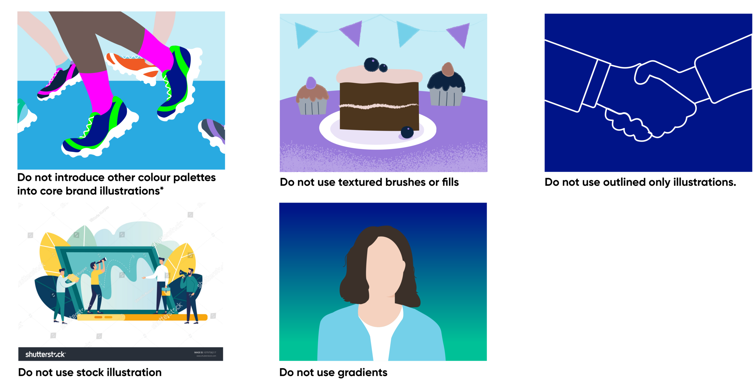
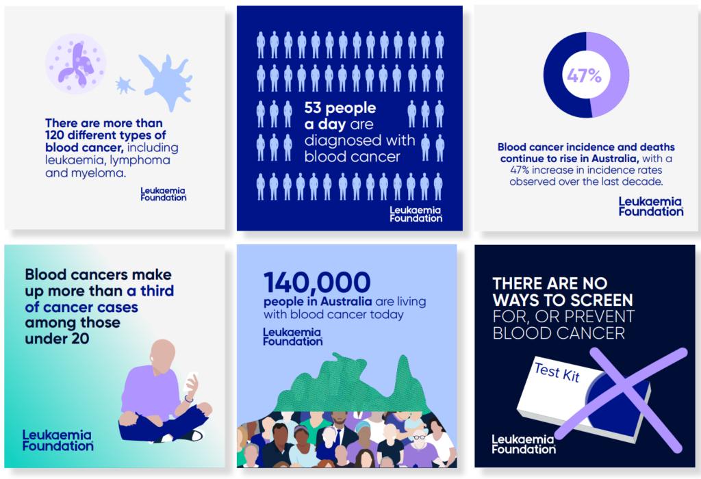
A comprehensive suite of illustrations and icons are available for use by all Leukaemia Foundation staff in our resource library (staff login required).

People living with blood cancer have specific characteristics which can help to illustrate their presence. We try to reflect those characteristics, where appropriate, in our illustrations, often using photography as our starting point.
Due to the disease and treatment, people living with blood cancer can often be pale in appearance and can have a port-a-cath in place, visible by the fabric ribbon tied around the neck. For children, a nasogastric tube, which is used to carry food and medicine to the stomach through the nose, may also be visible.
Some people lose their hair during treatment and choose to wear turbans, scarfs and beanies.
When illustrating people we do not use facial features eg eyes, mouth etc.
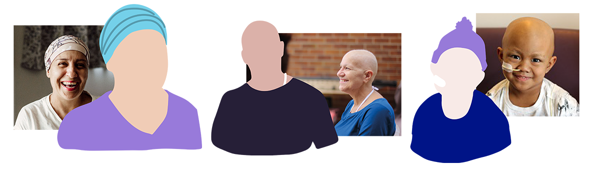
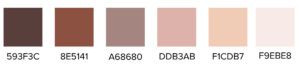
The Leukaemia Foundation cares about all Australians living with blood cancer and recognises the diversity in our communities.
We are inclusive of all nationalities and race and so we reflect this in a series of skin tones.